The fast food and breakfast cereals category is characterized by brightly colored packages with a large number of illustrations. The target audience of breakfast cereals are active residents of megacities, mostly women, with an above-average income. They have a lot of worries, and breakfast cereals allow them to save time on cooking. They can buy them for themselves or for children. In the first case, girls usually look for naturalness and choose a variety of porridge with fruit, granola or granola. Products for children are sweet cornflakes. They are also bought by parents (more often – moms), but the design of the packaging is more oriented to the child.
Types of breakfast cereals:
- instant porridge (with or without additives);
- sweet cereal (can be in different shapes);
- muesli (cereals, dried fruits, nuts, bran, wheat germ, honey);
- granola (oatmeal with nuts and honey).
Cereals are characterized by a child-orientation and large pack sizes, as well as an abundance of characters on the labels. The marketing strategy of such products is usually built around a happy childhood. Energized, kids are ready to run and explore the world. The product itself is presented as a tasty and healthy option for a quick breakfast. It is offered to be poured with milk juice or yogurt. Usually all of this is stated on the packaging, sometimes in the form of an infographic. The most frequent visual element that is present on the cereal packaging is honey and a spoon for honey.

Products aimed at women are characterized by less bright and more refined packaging. Here the main emphasis is placed on the usefulness and dietary qualities of muesli or granola. Manufacturers build an image of the consumer as a successful, beautiful girl who follows her diet, loves herself, does sports and chooses quality products. Also part of the positioning of such brands is vigor and morning energy, which users will get by buying a breakfast cereal. The size of the package of porridge is standard and, depending on the manufacturer, varies around the mark of 0.5 kg. There are also portioned porridges on the market. One bag – one meal.
Male versions of breakfast cereal packaging designs are harder to find. We managed to find 2 concepts (unrealized projects). The first was “porridge for real men” and the second was a unisex package in the shape of a cone and a packet of milk. Still, most of the products are aimed at women. In the extreme case – is neutral in terms of color scheme. Manufacturers use yellow, green, white and orange colors. At the same time, it is not difficult to find more “masculine” packages for children. For example, the famous American Cap’n Crunch cereals are designed more for boys.
In previous KOLORO articles we wrote about STM design, alcohol, cosmetics, candy, tea. All articles with the tag “design” can be viewed on the blog.

Packaging requirements for breakfast cereals are the same as for other food packaging. They should protect the product from external factors during transportation (snow, rain), help to keep its shape (corn flakes, rings and balls are very fragile) and preserve its taste (damp cereals are unpalatable).
If we talk about materials, then, still the most popular is the use of cardboard. The main plus is absolutely environmentally friendly packaging, which is quickly unfolded and renewable. Cardboard boxes help to preserve the shape of products: rings and flakes will definitely not crumble. The large area of cardboard packaging allows you to put a lot of information on the pack. In addition, cardboard is subconsciously associated with quality and naturalness. This can not be said about plastic bags. From the minuses – it can get wet and drench the contents of the package. Often cardboard packages are made without viewing windows, and the consumer does not see the product. The third and main disadvantage: the cost of cardboard packaging is higher than the cost of flexible plastic packaging.
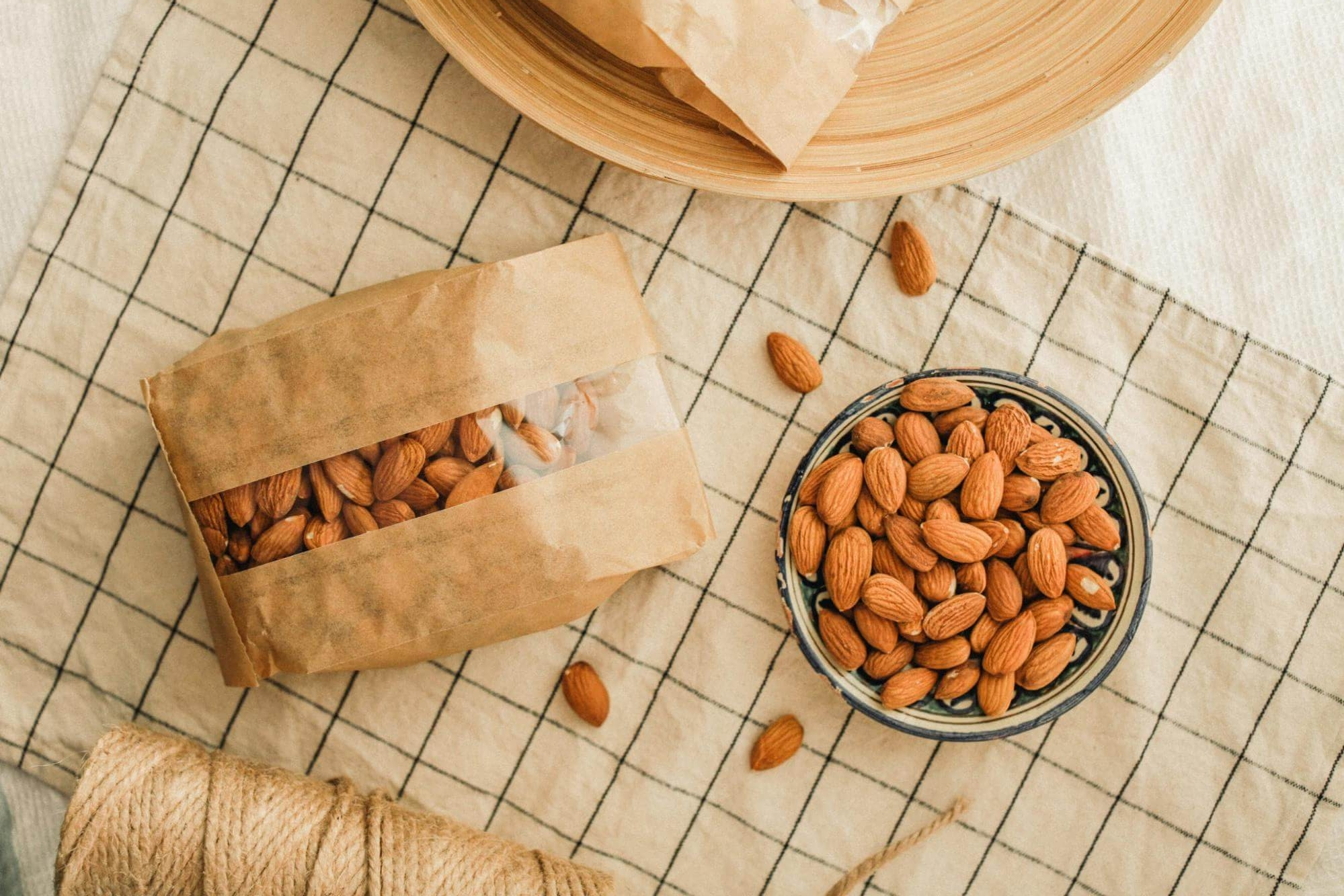
In second place is the flow-pack. It is most often used for instant oatmeal (sometimes for muesli). Flow-packs for large portions of cereal are also made of dense plastic film. Flow-pack is more practical than cardboard and its cost is lower. Flow-pack packaging can be partially transparent, allowing the consumer to view the product.
A new option (on the Ukrainian market) – doy-pak. A bag made of dense plastic that holds its shape is perfect for muesli, granola and oatmeal.

Porridge packaging design: problems and solutions
The main problem with breakfast cereal packs is the inability to close it after the first opening. Many consumers solve this problem by pouring granola, cereal or granola into special cereal containers. But some consumers are not a fan of such measures. A doy-pak with a zip-lock solves this problem. Packaging that is equipped with such a device will be an advantage for the consumer when buying.
The Flow-pack is less practical from this point of view, but it can be closed with additional devices: kitchen clothespins, stationery binders or simple paper clips.
Cardboard packaging is the hardest to do this trick with. However, while we were preparing this material, we found a design for a cereal carton in the shape of a milk carton. Thanks to the house-like shape of the packaging, it will be very easy to close such a box. We hope to see this solution on the shelves of Ukrainian supermarkets soon.

Packaging design trends differ depending on the type of breakfast cereal. Products that are geared toward children are the most colorful. The packs are reminiscent of cartoons and often have game materials on them. These can be game cards that need to be cut out of the pack or found inside. Also often on the back you can see small games: rebuses, stories about characters, crossword puzzles or information about promotions. It usually involves collecting some kind of prizes for labels or promo codes. All this stimulates the purchase of products, forms the UTP, distinguishes the brand among competitors, establishes communication with children and parents, and makes them loyal consumers.

Products such as cereals and muesli with additives, as well as granola, which is aimed at adults, are distinguished by more relaxed packaging. There is a lot of white color, often it is the main color. Manufacturers also emphasize the naturalness of the product: fruit on the packaging, inscriptions about the usefulness of cereals, often there are badges with recommendations of the association of nutritionists or notes about the useful substances contained in the product.
Along with the growing popularity of vegetarianism, a new category of quick breakfast foods is hitting the shelves: granola and “live” food (not processed thermally). The packaging design of these products is usually the most revolutionary. Colors and patterns may not be directly associated with the product. Often there is no image of the product itself on the packaging. Viewing windows and an inscription with the name of the category help to understand what is inside. Otherwise, the packaging looks like a piece of art in the style of pop art. For a wide audience, a more utilitarian pack would be a good option. Among vegetarians and vegans, who are usually creative types and like to stand out, such a pack would be a success. The Beginnings muesli from Latvia is an example of a successful design for a niche product.
If you are inspired by the above examples and want to blow up the market with an unconventional approach, contact a branding agency KOLORO. We won’t let you down.

Cereal packaging design is based on:
- aesthetics;
- usability (design);
- communication (message, appeal, message).
The first point can be characterized by the word “harmony”. Packaging should be designed in colors that do not conflict with each other, fonts should emphasize the brand image, and there should not be a lot of inscriptions. The more text the manufacturer tries to cram on the packaging – the less return it will get. The main rule is to build such a visual pattern to control the consumer’s gaze. The right packaging attracts the eye with its illustration and leads the consumer’s eye through the rest of the elements: the title, supporting texts, infographics. It motivates a purchase. For this purpose, it does not have to be the pinnacle of design thought, using images that have not been in use before. The main thing is that all elements harmonize with each other and show a complete picture.

“Hrutka” and “Malyutka” are two great examples. Both packages are very simple, all elements and images are standard. Milk, honey, corn, a spoon for honey, “appetizing” images of products, a spoon with fruit scooping porridge – there is no novelty in all this. However, the image is very whole and harmonious:
- no unnecessary text;
- the logo takes up enough space to be noticed;
- colors and fonts are well chosen, they concentrate attention rather than disperse it.
These two products are a great example of proper sales packaging.
Simple and tasteful – if these words are about your brand, contact the KOLORO. We share your values!
Instant porridge packaging design: an unconventional approach
The Dorset Cereals case was famous in its day. The brand produced its products (good quality oatmeal) in a simple flow-pack for 20 years. However, in 2006 there was a redesign of porridge packaging, after which the brand value grew from £4m to £45m in three years. How did they do it? Let’s compare the packaging before and after. One look is enough to realize that the second one is more advantageous. Firstly, the cardboard adds value. Secondly, the brand name in the new version looks much more expressive. In the old version, only the category name catches the eye: granola. Thirdly, it is the colors. The designers chose calm shades, which are not usually used for muesli. In addition, they did not draw pieces of fruit or nuts on the packaging. The entire range of packaging is in natural colors. This echoed the brand’s new signature feature: the cereal spike, the grains of which act as viewing windows. It is the basis of communication with the consumer and emphasizes the brand’s slogan: “Honest, tasty and real”. To confirm the honesty, the composition is indicated below, under the brand name, in large letters on the front of the package.

In 2015, Dorset Cereals redesigned for the second time and developed the concept of natural food and premium quality. The concept remains the same. Calm colors in the base, the composition in big letters on the front, viewing windows and markings in the corners (new or classic taste). However, now the basis of communication is not the spike, which has become a rather straightforward image, but nature. The designers developed their own characters for each package: squirrels for nut muesli, peacocks for berry muesli, chanterelles for organic muesli. All this helped to emphasize the brand’s individuality and its closeness to nature. In addition, new supporting texts appeared on each pack:
- gloriously nutty muesli;
- our lovely organic muesli;
- luscious berries & cherries muesli;
- fantastically fruity muesli.
They help establish communication with the consumer by praising the product.

Quick breakfast packaging design: executive summary
Depending on the target audience, the approach to packaging design for ready-to-eat breakfasts can vary. Thanks to our review, we have highlighted several factors.
- Corny doesn’t mean bad. Most market leaders do not reinvent the wheel, but beautifully present well-known stereotypes about quick breakfasts. They use recognizable symbols, draw milky rivers, add appetizing images. This approach works if harmony is observed.
- Ease of use is an advantage. If it is possible to provide for closing the package after the first opening, it is worth using it. Such a package will get additional points and will sell better. And if the manufacturer is the first to offer a new form on the market or in a segment, it will become a good UTP.
- A change in packaging design can increase brand value by more than 11 times. The first redesign of Dorset Cereals proved that.
- Supporting texts help to communicate with the consumer, and characters can be recognizable even if they are drawn in flat style. Dorset Cereals proved this with their second redesign.
- Original packaging that does not look like all the others is a good option for niche products. This is what the experience of The Beginnings brand has shown.
To create a porridge packaging design that will bring new customers and increase your company’s profits, contact our agency. Our ideas are always backed up by analytical research, which means that the design by KOLORO is doomed to success!