Federal Food Company is a young, modern and dynamically developing – a significant player in the Russian alcoholic beverages market and a leading company in the Leningrad region and the city of St. Petersburg. In its product portfolio, the company has many well-known vodka, wine, brandy and other alcoholic brands – “Scandinavia”. “Thousand Lakes,” “National Leader,” etc. One of the latest novelties of the company was the vodka brand VVP (Vodka of All Generations).
Building a brand from scratch always requires a lot of effort. This includes market research, conducting surveys, designing the label, cap, logo and bottle geometry, unique selling proposition and positioning, and more.
Work on the project began with the design of the bottle of GDP vodka, which emphasizes the status, nobility and greatness of the product. Once the bottle shape was developed, 3 label designs were created. Each design has its own unique selling proposition and positioning. A unique line of names and a different logo was created for each concept.
The concept of “People’s” is based on the need for unity with nature. This label design option indicates the naturalness and naturalness of the product.
The design elements that set the unified communication of the concept were chosen as:
Unique selling proposition: “on soft wheat”, “aged on oak bark”. The focus group survey showed that consumers label the concept as nostalgic and soulful.
The concept “Time” is designed to capture the emotions associated with consumers’ desire to be experts, connoisseurs. The positioning of the product is for intellectuals, those who consider themselves wise, insightful, or those who are simply satisfied with the quality of their lives.
Lineup of titles: classic and modern. The large identifying element on the label and heel of the cap is the clock face, the numerals of which change in a linear pattern. A watch is a recognizable and non-trivial element.
The background of the label, made in the form of a diamond-shaped grid, catches the eye. The background of the label is three-dimensional and has tactile properties. For a more eye-catching look, you can accomplish this background with a contrast of matte and glossy varnish, or you can elevate the grid with a congreve, or combine both methods. The name is written in large contrasting letters, making it easy to read even from a great distance.
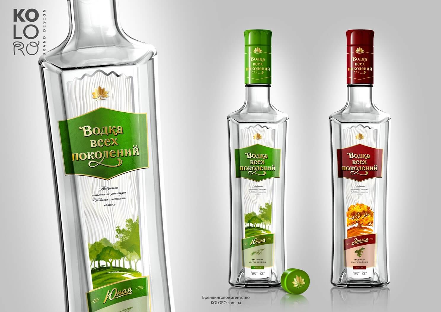
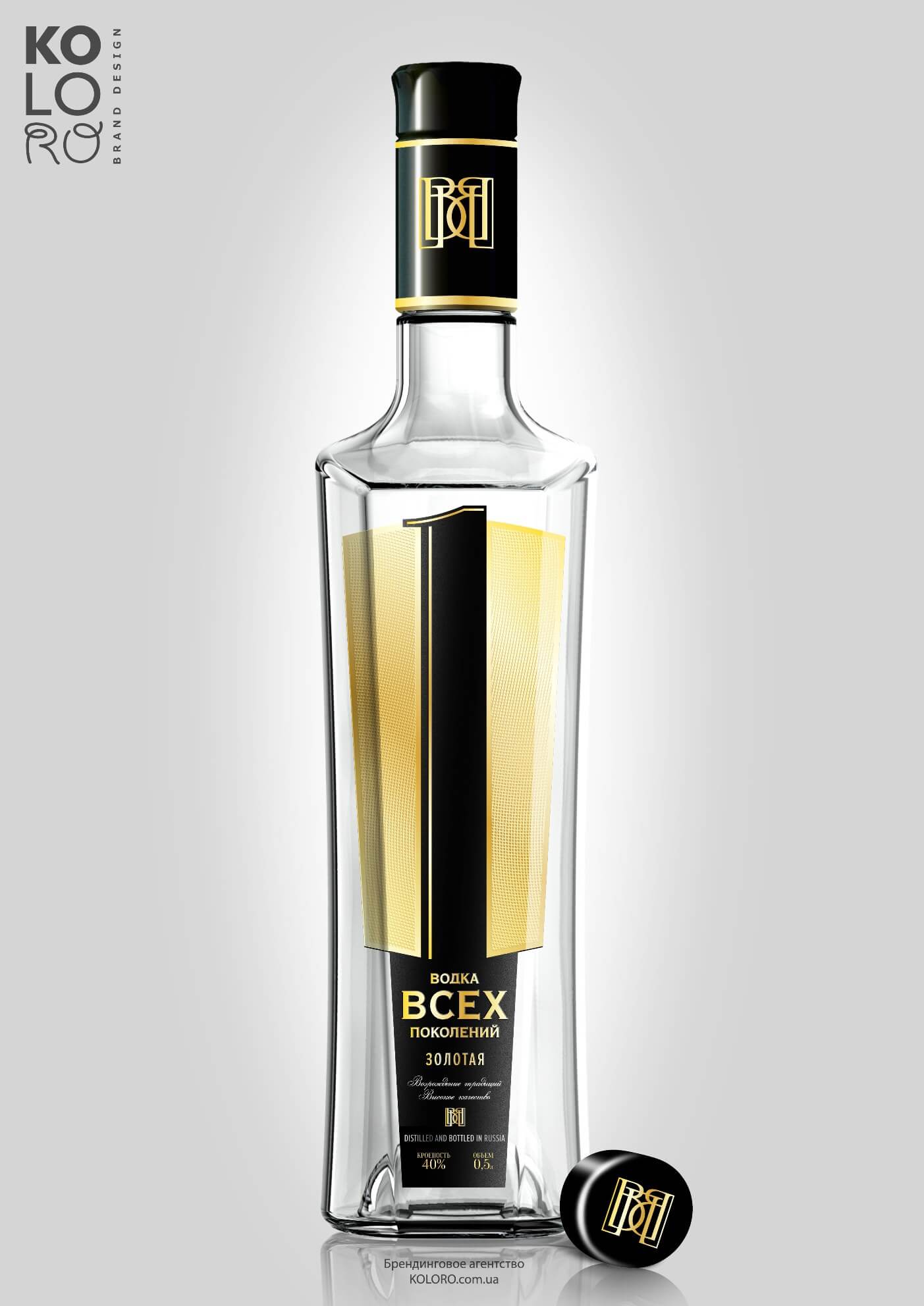
This concept is based on primacy and leadership. Vodka’s positioning is for status-oriented people. The design of the label looks modern. The label is in the shape of a cup. This long label, glitter and contrast of colors will definitely catch the attention of consumers on the shelf.
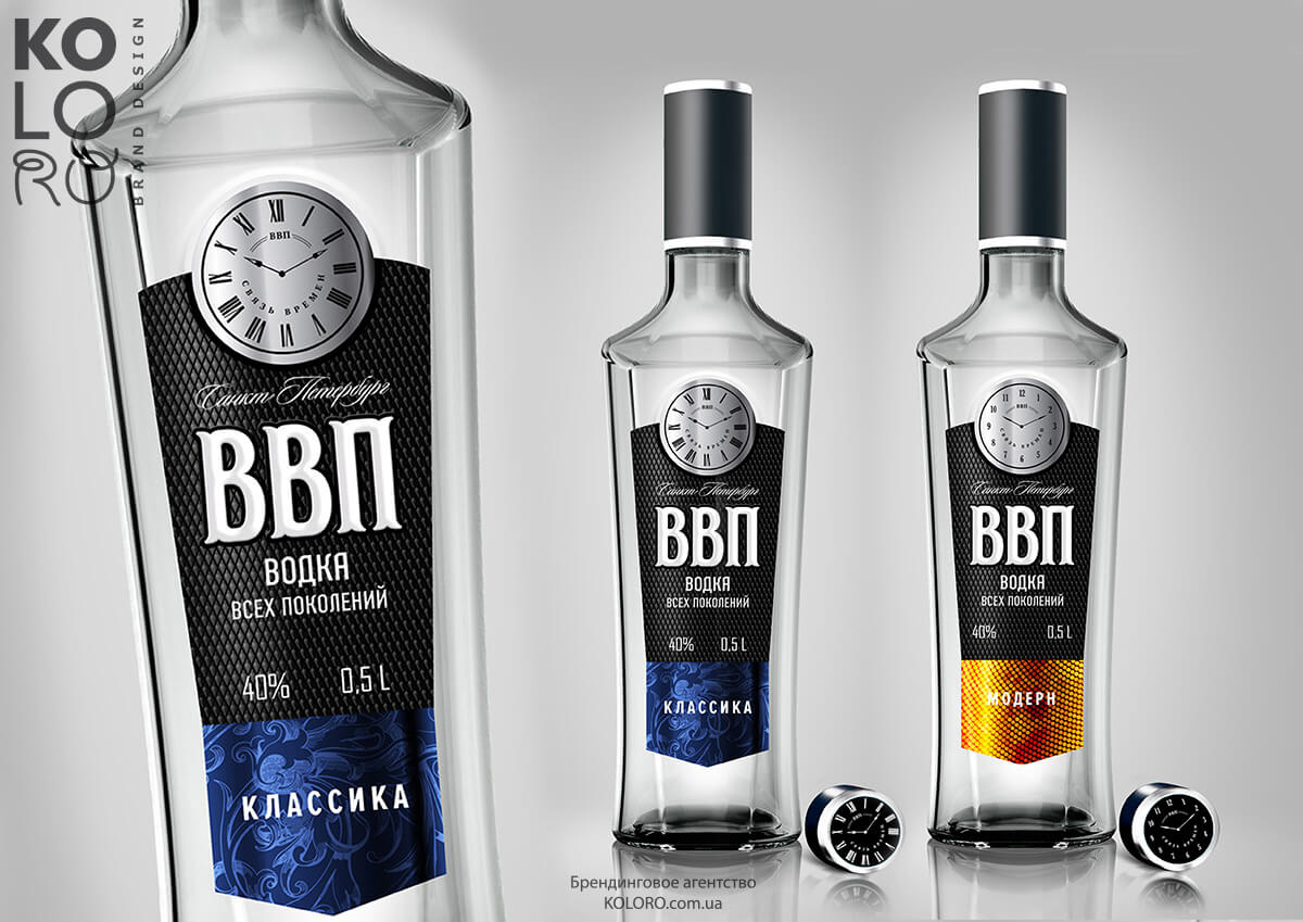
The centerpiece of the label is a huge unit. The focus group survey showed that consumers perceive the product design as austere and businesslike. The word “presidential” came up repeatedly.
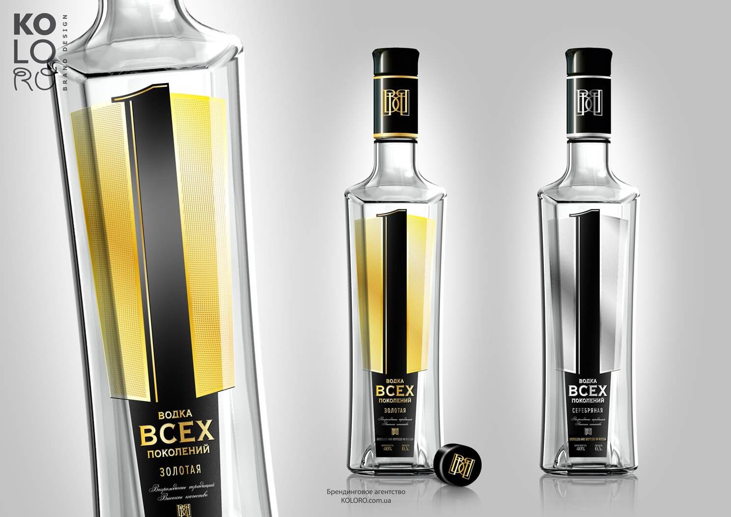
The key to the concept may be the tactile experience of the product. Half of the label is texture, which needs to be embossed and voluminous to firmly position the product as technologically advanced, quality, with undeniable credibility.
The color of the label – the color of precious metals (gold, silver) – maximizes the theme of leadership and success. The color finds its continuation in the line of titles: gold, silver. All elements of the label complement each other, creating a strong communication of “leadership and technological superiority”. This communication is unique and tailored to the needs.
The new vodka brand “GDP” is already on free sale in the Leningrad region and the city of St. Petersburg. Vodka Vsekh Pokoleniye – a status and quality vodka-leader has not only been recognized by consumers, but also highly rated by Russian experts.