They say that seeds are a drug from which it is impossible to “get off”. And while our project manager ran to the store for a fifth pack, we’ll tell you about how we developed the branding of the seeds.
Our client is a novice producer-enthusiast, who for a long time studied the technology of roasting seeds, saved money for the necessary equipment, and finally decided to enter the market. Our specialists were required to carry out branding, in particular to develop positioning, UTP and packaging design.
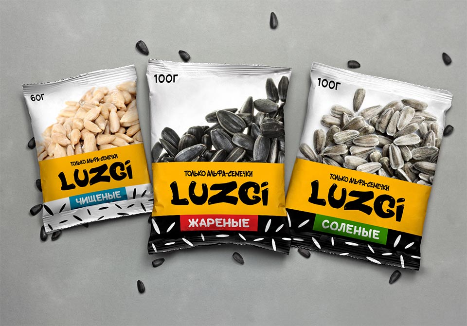
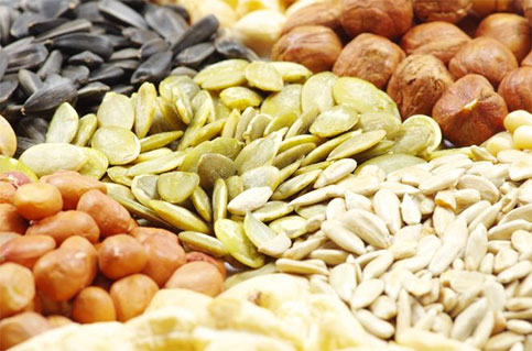
Based on the results of the five stages of naming, LUZGI was chosen. It meets all customer requirements, is equally readable in Russian and Ukrainian and reflects the features of the product (sounds delicious, “crispy”). The name evokes associations with the process of consuming seeds as they say in the people, husking. Usually, seeds are husked when having a nice time, relaxing in the company of friends or alone. The chosen name has been registered as a new trademark.




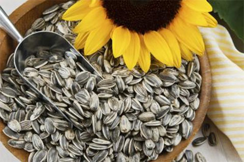
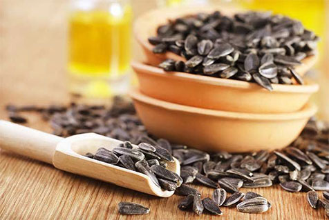
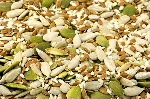
Based on the results of the naming process, LUZGI was chosen. It meets all the customer’s requirements. The name evokes associations with the process of consuming seeds – as the people say, husking. The chosen name has been registered as a new trademark.

Together with the client, we decided that the best solution would be to create 80 and 130 gram mini formats. It is necessary for buyers to familiarize themselves with the product first, because few people will risk buying a big packet of seeds from a new producer. Once the brand becomes more well known, you can safely release a maxi format.
Metallized polypropylene with a matte surface was chosen to create the packaging.
It was envisaged that the print run would be printed on the customer’s equipment, so the customer provided ready-made packaging cuts.
KOLORO’s marketing team developed several positioning ideas that would work well with the packaging design. Among the prime examples:
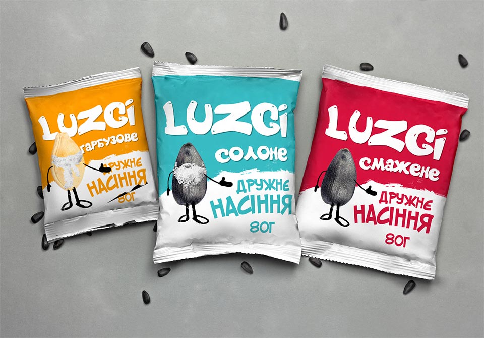
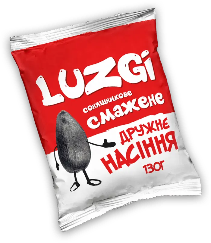
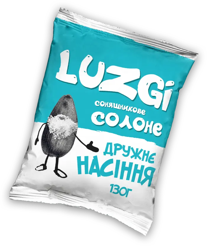
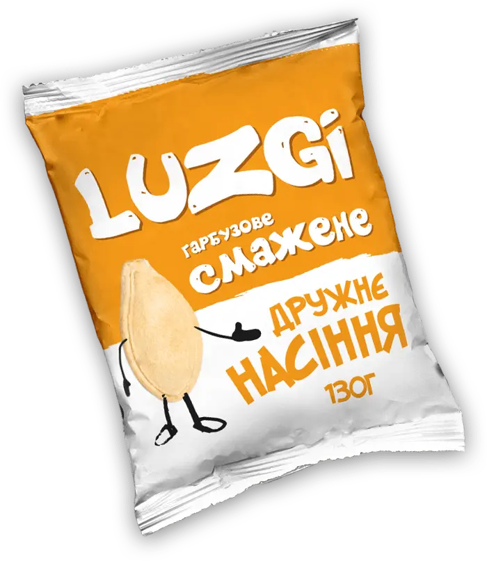
The client liked the “LUZGI friendly seeds” more than the other concepts. The color range consists of white and one more bright color (depends on the type of product). The fonts are large, with soft bold lettering.
The identifying element is a “friendly” seed that entices you to try new products.
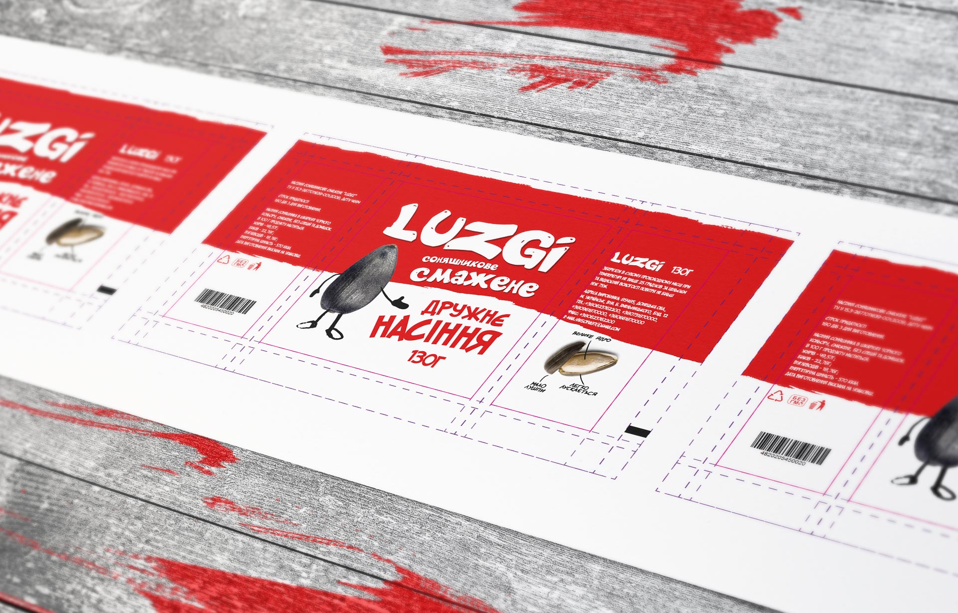
The back of the package contains all the elements required by law: data on the manufacturer, conditions of storage and consumption of the product, weight, nutritional value and barcode.
Red and white color scheme. The character is a black sunflower seed.
Turquoise and white color scheme. The character is a black sunflower seed with a “beard” of salt.
Orange and white color scheme for regular and salad white for salty. The character is a pumpkin seed.
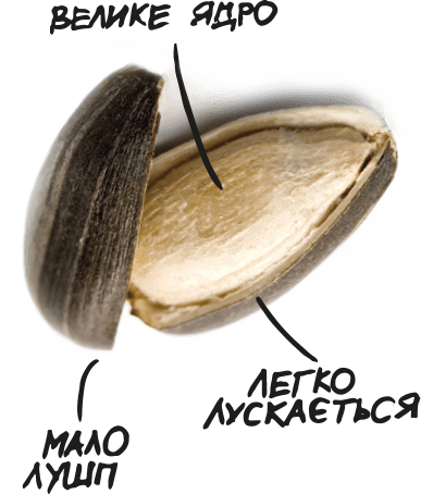
On the back of the package is a small infographic – a peeled seed surrounded by the captions “Easy to husk”, “Few husks” and “Large kernel”. That is, LUZGI are not only tasty and natural, they are also pleasant to eat while relaxing alone or in company.
The brand was warmly received in eastern Ukraine, so LUZGI is planning to expand the geography of distribution to the whole territory of the country in the near future, and maybe even further :). We wish LUZGI success in new endeavors, and we are waiting for you. Let’s work together to create a new brand that will win the hearts of millions!