TM “Chistaya Pravda” is a new vodka brand conceived as a local brand. Today it is a promising and in-demand product on the Russian alcohol market.
Creating a new brand is not an easy and costly endeavor. However, based on the customer’s budget and the fact that this vodka will be sold in the economy segment, it was necessary to develop a new brand, label design, positioning concept and UTP, to think over the bottle closure with minimal costs.
The project started with the design of the label. Based on the limited budget, the customer was offered a ready-made, off-the-shelf bottle in a standard rounded shape. Several label and cap designs were created in the process.
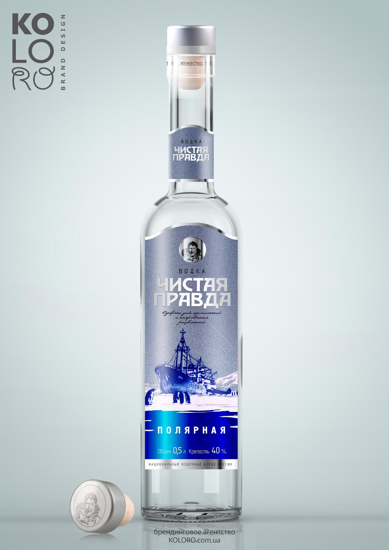
The developed concept “Polar” is aimed at a wide category of consumers who can be characterized as “Adventurers”. The following were chosen as identifying elements: the gray-blueish color of the label, the portrait of the explorer on the badge at the top of the bottle, and an illustration of a polar expedition.
The focus group survey showed that this packaging design is perceived as a “design from the past”, which is particularly emphasized by the poster style of the image, “Soviet-era” fonts, and blends well with the simple shape of the bottle. Concept keywords: purity, distant journey, snow, cold, courage, unknown, piercing power.
Lineup of titles:
However, at the end of the project, a different concept won out – the Fisherman. The Fisherman concept is positioned for a broad audience of consumers who value socializing and friendships, who want to be part of a company. This positioning for vodka is the most successful and most sought after. The focus group survey showed that consumers perceive the concept as “vital,” fun and humorous. Consumers describe the concept with these words: humor, relaxation, communication, and trust. Therefore, we chose the theme of fishing deliberately. Fishing is the best excuse to meet and socialize with friends.
The main identifying elements chosen were:
While drawing many options for the cap design, it was decided to offer the customer a camu cork (T-shaped cork) as a closure.
The following TSS is proposed for this concept: CARLUK Fish Glue cleaning technology. The essence of technology: fish glue karluk, added to vodka dissolved. The glue gradually clots, settles and takes on harmful impurities. The technology was invented in Russia in the 13th-15th centuries, and was very popular then. But, due to the gradual substitution of expensive technologies by cheaper ones, vodka purification by “pasting” was undeservedly forgotten by Russian vodka makers.
The newly launched vodka brand “Chistaya Pravda” has won a wide range of consumers and a weighty share of the alcoholic beverages market. Positive and soulful label design, properly selected identifying elements and communication message to the audience played a significant role in attracting customers and gaining their trust and loyalty. The new brand has received high marks from experts.
Building a brand is not an easy task, but it is essential for success. An “untitled” product will never be a colossal success, it will go unnoticed. A brand, and not just a registered trademark, but a Brand with a capital letter with “royal ambitions” – not just profitable, it is a guaranteed market leader!