Rebranding is a set of marketing activities aimed at updating the appearance of a brand and optimizing internal business processes. If we are talking about supermarkets, competition in retail is at its peak today. Customers have become more demanding and discerning. They want to receive offers that match their needs and capabilities and to shop in clean, spacious premises that they want to return to time and time again.
The goal of rebranding is to win back, retain, attract customers, and increase turnover and profits. The main reasons for rebranding:
- loss of market position;
- transformation of the buying environment;
- the need to adjust the company’s image to take into account communication trends;
- internal changes.
In this article we have collected 5 successful cases of rebranding retail chains , which will eliminate the fear of change and inspire new achievements in business!
Case #1. Rebranding Silpo
The purpose of rebranding: to build off competitors, to increase customer flow by attracting new audiences, to increase trust, to realize internal changes through the visual perception of the brand.
The Silpo supermarket chain is an example when rebranding became a springboard for scaling up.
- Complete update of corporate identity
- Elements of the game
- Experiments with trends and tendencies
- Design of sales areas
- Revision of service standards
- Improved logistics
- Constant expansion of assortment
The company’s rebranding revealed a different side of the brand and made consumers reconsider their attitude towards it.
“Silpo” is one of the largest retail chains in Ukraine, which has 270 stores in 60 cities. In 2019, three of the chain’s supermarkets have made it to Europe’s finest stores 2019, a European showcase list published by profile retail publication European Supermarket Magazine.
Each year the magazine presents a list of impressive retail store designs. “Silpo became the first Ukrainian representative to make the list.
Each new Silpo store is a separate world, connected with other names and corporate identity elements.
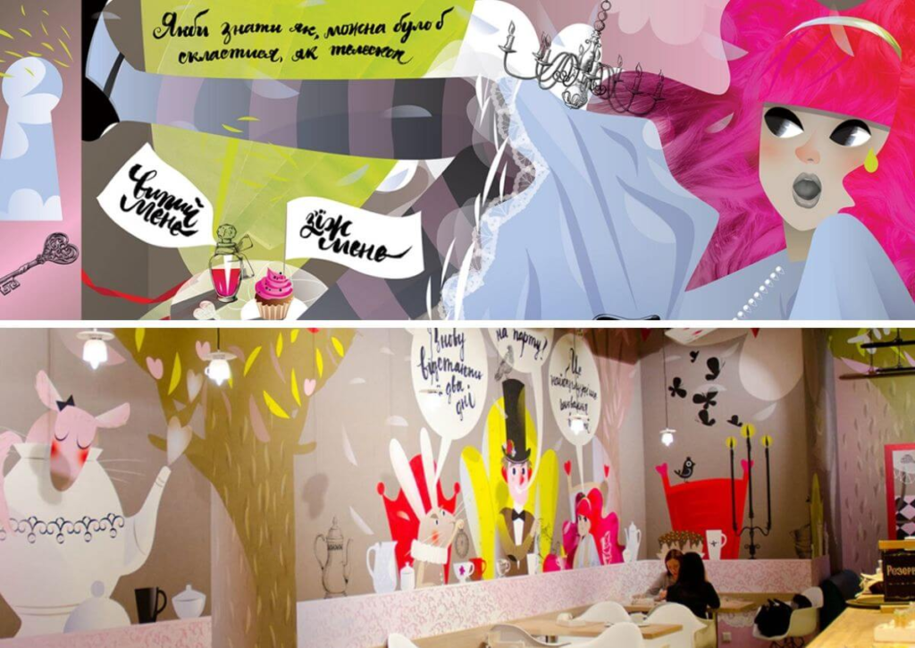
In Lviv clients get into Lewis Carroll’s fairy tale “Alice in Wonderland”
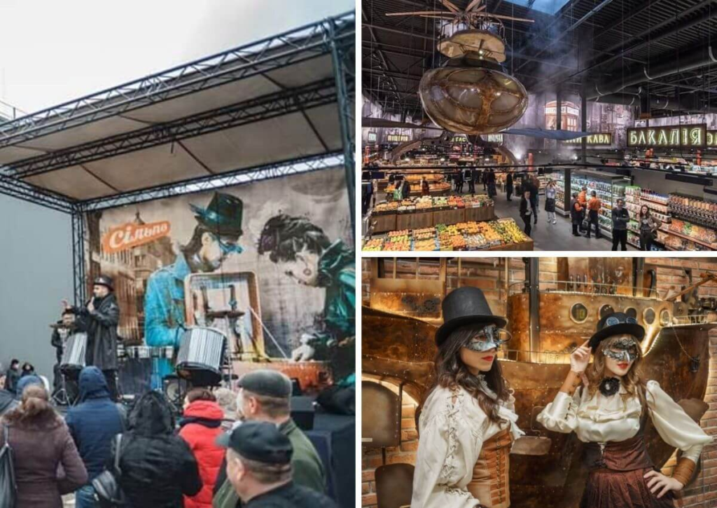
In Vyshgorod, buyers can expect steampunk-style sci-fi. Built a store from scratch on the territory of an industrial zone
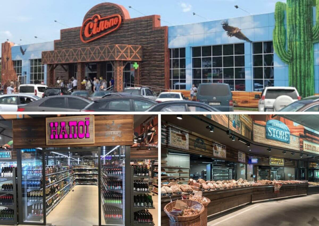
In the Parking Lot, shoppers are transported to the Wild West
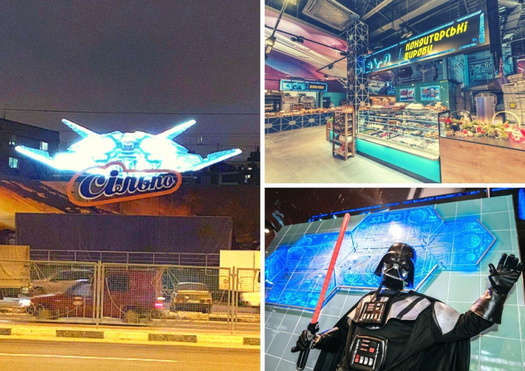
In Kharkiv buyers make an expedition to space
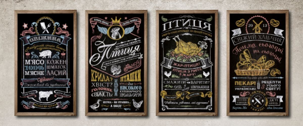
The chain’s corporate identity can be read in details, such as the slate boards placed in the fresh produce departments, where you can find motivational inscriptions, “Hot Deals” and other useful or interesting information.
Do you like the design? You want better? KOLORO can help you develop a recognizable corporate identity.
Case #2. Rebranding of the ATB chain
The purpose of rebranding: to increase turnover, attract new audience.
The largest Ukrainian retail chain ATB is a discounter adapted to the geographical and mental needs of the target audience.
Discounters are stores with:
- with a narrow assortment;
- with a small number of service personnel;
- inexpensive exterior and interior design;
- with minimal logistics and advertising costs.
This business model is based on maximum cost reduction at all stages, so that the cost of goods for the consumer is lower than the average market price in the country.
“ATB is the first and the only discounter in Ukraine. Unlike the classic European representatives of the format, which offer customers an assortment of goods up to 1000 articles, ATB has 3500 and more articles.
Since its inception, which is the early 2000s, there were no changes in the ATB chain until 2016. Since 2016, the brand has rethought its positioning and made significant adjustments to its business processes. The chain includes more than 1,000 outlets nationwide, of which 80% are personally owned by the retailer.
It is not only the logo and corporate identity that has changed.
Updated stores:
- got wider aisles;
- freed from advertising and vendor refrigerators;
- purchased and installed new refrigeration equipment;
- expanded the range of vegetables, fruits, meat, wine and a number of other goods;
- installed innovative energy-efficient heating and lighting systems;
- improved the quality of service;
- replaced the carts;
- have partially abandoned security;
- dismantled part of the facade.
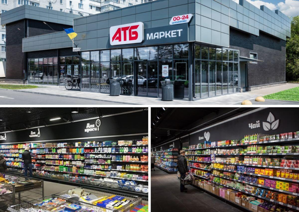
Bottom line: after ATB rebranding, the retail turnover increased by 20-50%.
Fast, quality and effective rebranding for all purposes and formats at KOLORO. Click through and find out more.
Case #3. Rebranding Auchan
The purpose of rebranding: retaining old and attracting new customers, restoring brand reputation.
The French retailer Auchan broke into the Russian market in 2002 and immediately created a sensation. Big bright stores and a gorgeous selection of products to suit all tastes. People were willing to stand in line for three hours for French cheeses, pastries and dairy.
The chain lived up to the slogan, and for a while kept prices low with a large assortment. But when the crisis hit, prices went up, the level of service deteriorated, and the quality of goods left much to be desired. The fresh produce departments tried to sell outright garbage, and not even the first freshness, which resulted in a loss of customers.
Russians favored supermarkets near their homes, as they value time and comfort. And, of course, I want to buy fresh food at normal prices, and it has become unprofitable to buy in “Auchan” .
In 2014, the world imposed sanctions on Russia. The public’s favorite French cheeses and sweets became unavailable. “Auchan is losing customers again.
Then the management thought about it and reconsidered its attitude to customers, positioning and prospects. It was decided to rebrand the chain, not limiting itself to changes in corporate identity design.
Updated stores:
- expanded the range of fish and oriental sweets;
- got new equipment for fresh produce;
- fresh produce departments sell really fresh produce;
- are divided into two worlds: frosh and non-food and grocery;
- are equipped with cozy cafes;
- ensured communication with customers through “human” slogans: “Welcome”, “My Fresh Bar”, etc.;
- received cosmetic repairs, lighting upgrades;
- are equipped with workshop areas.
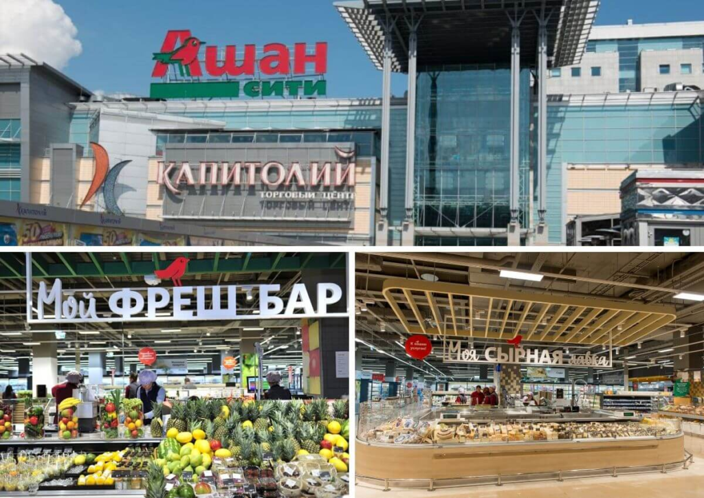
Bottom line: The rebranding affected several stores in Moscow and caused a wave of negativity among regular customers, as they have to get used to the innovations. At the same time, visitors note that the new Auchan has become better. Whether the entire network will change in Russia and the post-Soviet space is not yet known.
Case #4. The Comfy rebranding
The purpose of rebranding: to make the brand recognizable and to build off competitors.
Comfy retail has always communicated with the audience in a “human way”, without officiousness and “store ponts”. That said, it had no memorable logo, no interesting ads, and no character.
Faceless and unemotional, the Comfy brand was until 2016. The rebranding touched the logo, the development of special fonts and the character. Change is built purely on emotion.
The basis of the new concept was joy – from shopping, technology, acquiring new gadgets. The development of the company’s corporate identity took 2 years and in 2018 the whole country saw a complete transformation of the retail chain.
“Comfy made happiness a brand and called it Push. Push is a material that can be used to make anything, anywhere, and any way you want.

Push can be a trampoline, a bed, or even a character that interacts with electronics or appliances. People, machinery, spitzes, and anything else the imagination can conjure up out of Push. And thanks to the cool font, the brand effectively “speaks”.
Bottom line: the color scheme, the hero, and the clever ad campaign met and exceeded the objectives. “Comfy has become a sales leader.
Don’t repeat someone else’s exploits – create your own successful rebranding story with KOLORO.
Case #5. Rebranding “Rublevsky”
The purpose of the rebranding: to incorporate the brand into the existing group of companies.
In 2018, the Santa Group of Companies acquired the Rublevsky supermarket chain and immediately started rebranding anddevelopingits corporate identity. The store in the center of Minsk was the first to undergo changes. The changes began not with the signage, but with a global transformation of the sales floor and a revised attitude to customers.
In the revamped store:
- the interior is steeped in the history of the city;
- the aisles have widened;
- added sections and divisions;
- the assortment of vegetables, fruits, fish, wine and other goods has expanded;
- you can grill the meat.
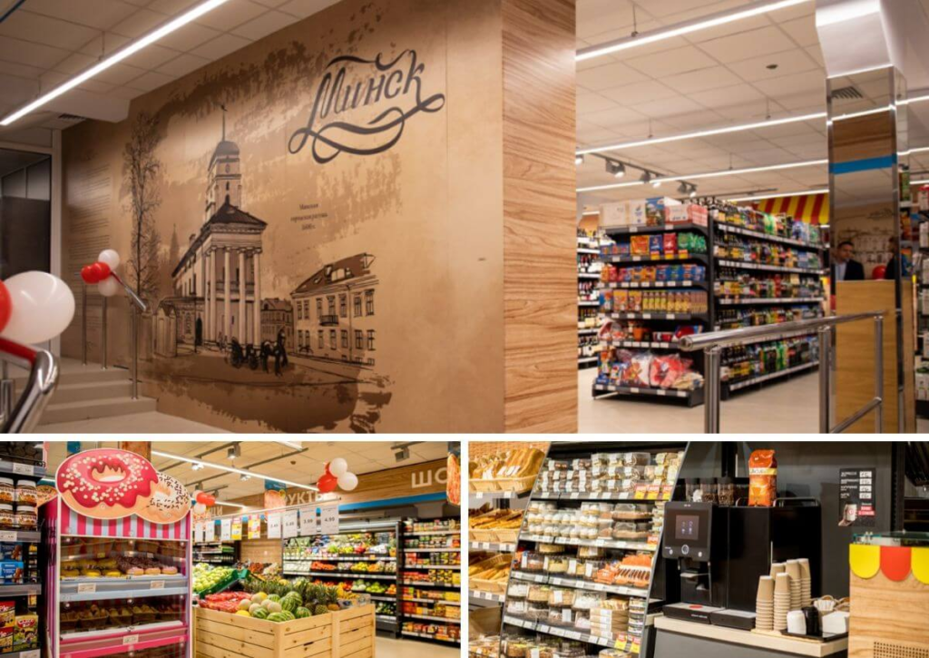
The result: according to the owner of the brand the result of rebranding is positive, and in the near future there will be large-scale changes in the Rublevsky network throughout Belarus.
Company branding: the bottom line
In this article we have briefly analyzed what rebranding is and why it is necessary, considered 5 vivid examples of the tool working onwell-known retail brands. As you guessed, it is not enough to change the “wrapper”. A new logo won’t save a brand from collapse or increase sales.
If you save on rebranding, you can lose more – the trust and interest of customers, profit. Upgrade – and fall in love with your customers forever.
You can ask questions and order rebranding service during business hours.