KOLORO was approached by the owner of a network of hybrid vehicle service stations. The problem was the following: the corporate style of the brand had not been changed for a long time, so the service stations looked out of date. In essence, a visual and ideological “update” of the company was required – rebranding. However, together with the client, we decided to do a full branding of the electric car service station network, coming up with something completely new. In addition, the client ordered the development of a Hybrid service station business card website.
We were tasked with developing elements of corporate identity:
The new corporate identity should be modern, simple and straightforward. Before getting started, we did some research on the hybrid car market.
Having analyzed the identity and corporate style of electric car service station brands, we have identified two design trends – techno and eco. Technostyle is characterized by correct geometric shapes, restraint and brevity, colors – gray, white and metallic. But technomotives are also used by many traditional car manufacturers, and there is a high probability of getting lost in their background.
The ecostyle in the design emphasizes the main advantage of hybrid autos – environmental friendliness. As a result, our designers created a few techno-inspired brand identity options, but most of the concepts are designed in an eco-inspired style.
The development of the corporate identity of the service station began with the logo. The marketers researched information on the internet, conducted a small survey and talked to the customer. It turns out that most people associate hybrid cars with “green energy”. The results of the study were passed on to the designers.


In total, the designers developed more than ten concepts, and the final presentation to the client included the top three. The speedometer logo emphasizes speed as an advantage of hybrid cars, while the lightning logo emphasizes fast charging. The client opted for a concept that we described with the keywords “charge, current, action”. These are the most frequent associations about hybrid cars that audiences have.
The old logo underwent a dramatic change. Sharp angles, mismatched colors, gradients and acid lettering gave way to a concise typographic composition adorned with a leaf with an electric plug. The resulting image is simple, clear and memorable.
Green symbolizes sustainability and connection to nature, while blue symbolizes modern technology. The brand name uses the Days font with a soft, wide lettering, and the description uses the font with a narrow lettering.
We suggested using the logo on different substrates: white, blue and dark brown. The client chose a blue substrate, and as a result, the corporate identity of the service station network is built on a blue-green color scheme.
We offered 3 substrate options:
KOLORO Agency provides design and development services for different types of websites. In the case of the service station brand, we created a multi-page business card site. It gives visitors the opportunity to find out what the company does, its contact details, price list for services and other important information. We made it so that the user can achieve any goal in three clicks, whether it’s finding the phone number of a service station or reading about a service.
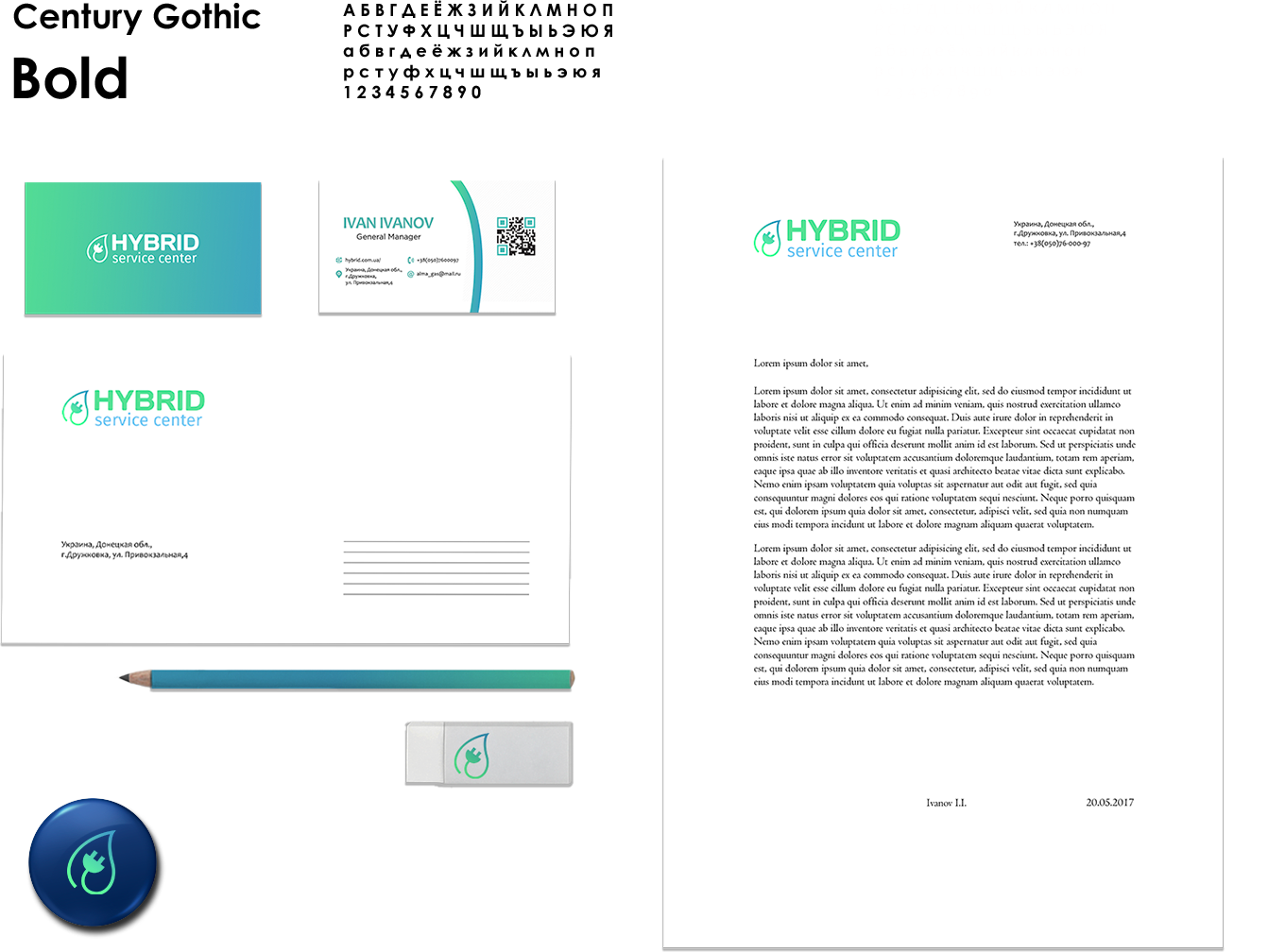
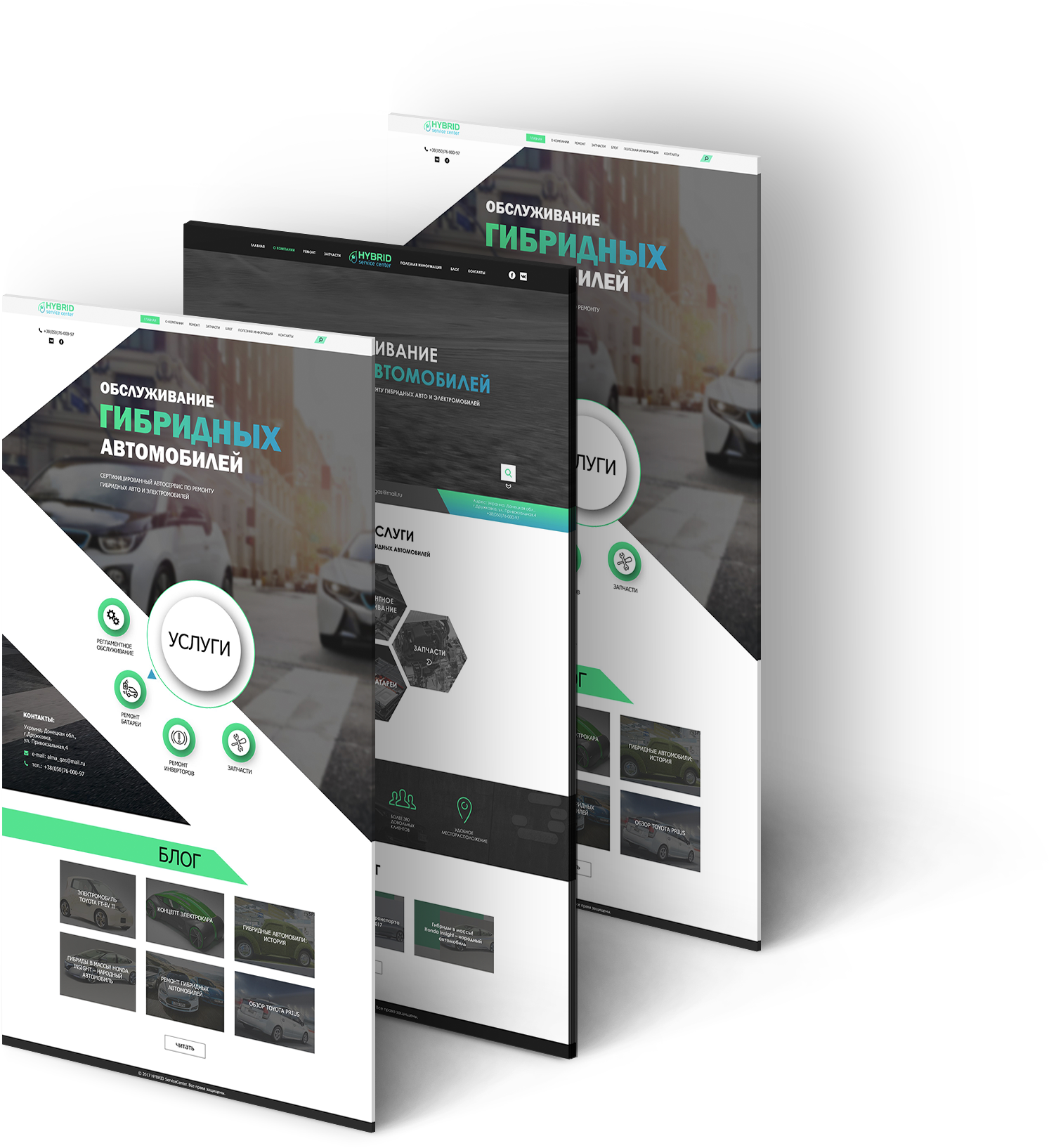
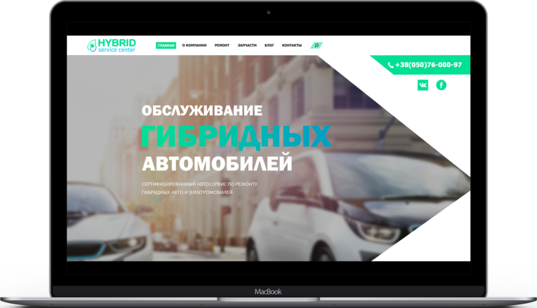
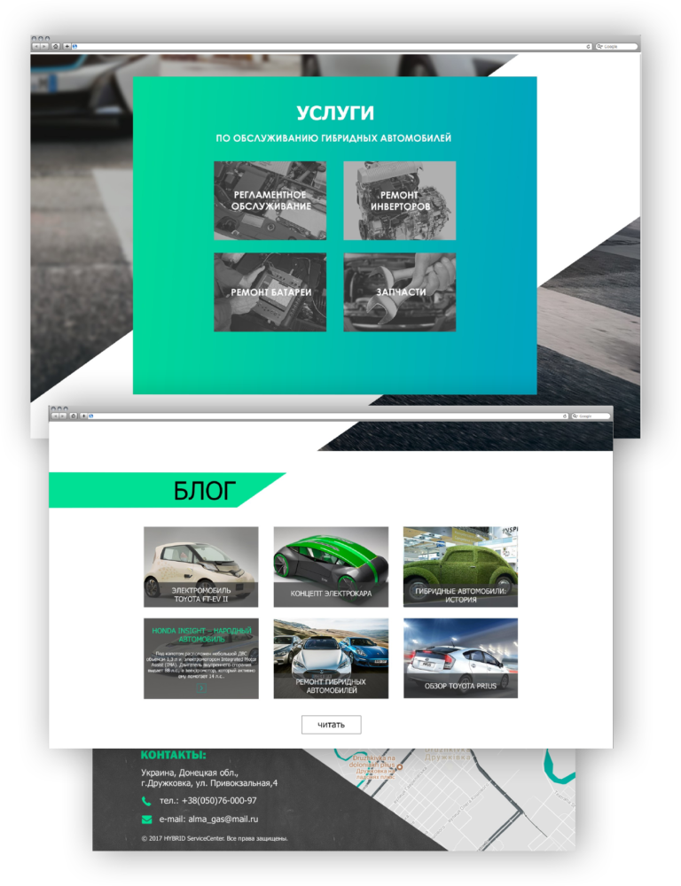
Check out our full list of services on our website. Among them, you are sure to find effective solutions for your business. With us you can order website development, corporate identity, logo, fonts or brand packaging design.
In addition, we can order brand development from scratch. We will help you to successfully enter the Ukrainian and international market.
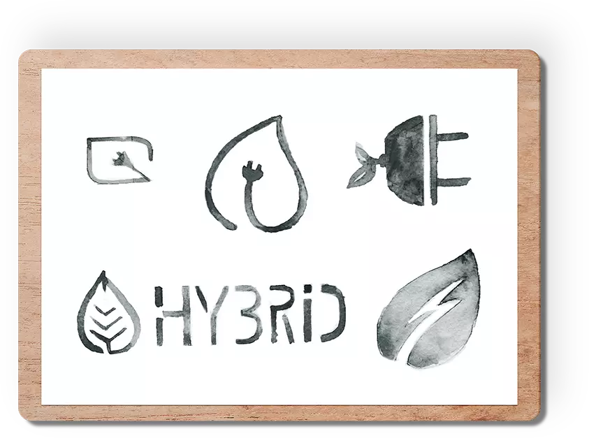
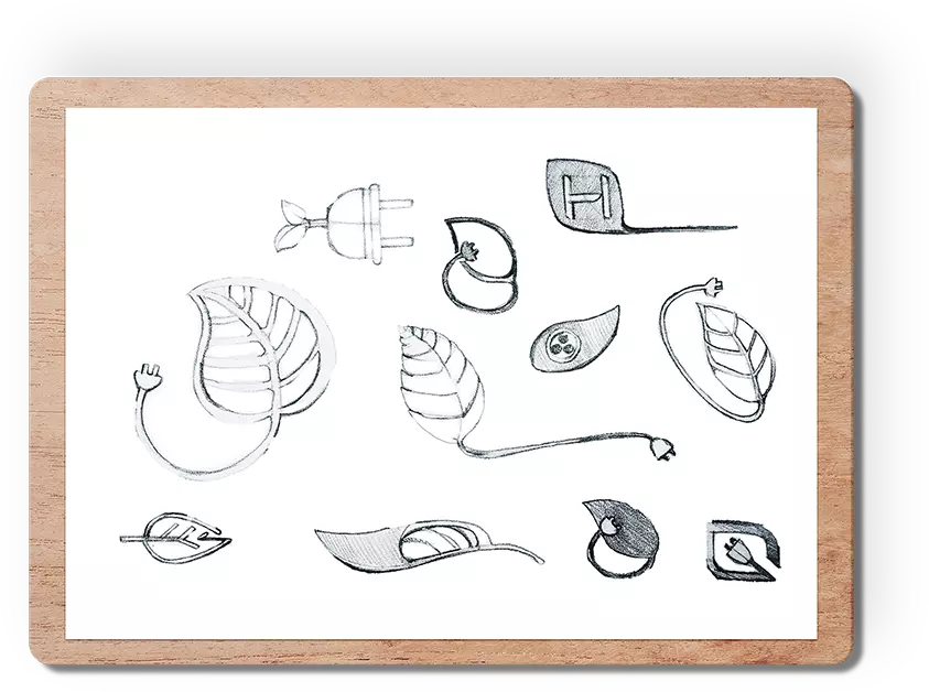
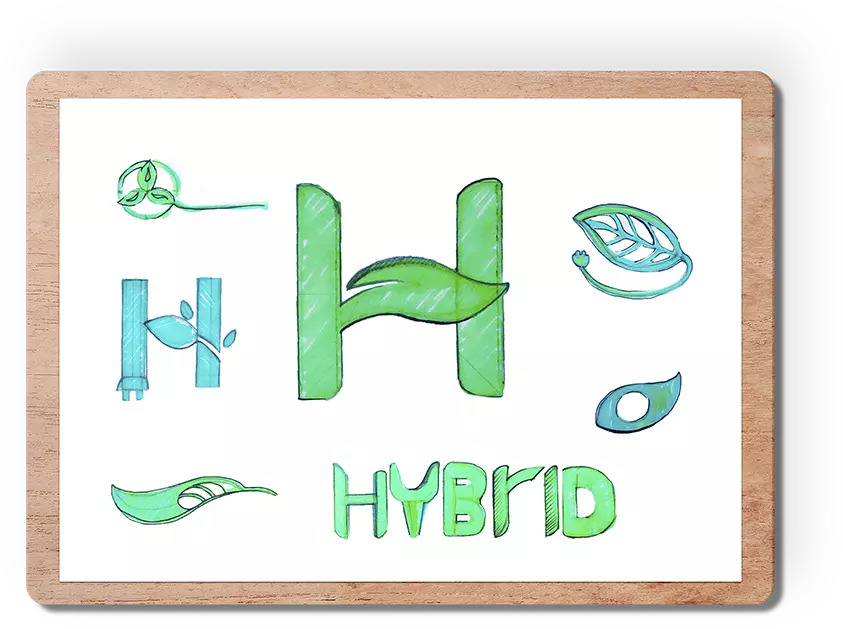
Would you like to see our other works? Visit the “Portfolio” page .