Reasons to order adaptive website design in KOLORO
Adaptive website design is the design of web pages for optimal display and convenient user interaction. The goal of responsive design is to optimize for any type of device and screen format.
There are two approaches to developing an adaptive website design. They are based on the primacy of creation: an interface for a smartphone or a website.
KOLORO employees take into account the interests of users and the specifics of their interaction with devices. After all, the phone is primarily used for quick tasks – searching for information, comparing prices, paying bills. A person using a computer has more time and opportunity to study and evaluate information in depth.
Based on experience and knowledge of human psychology, KOLORO specialists will offer an option to create an adaptive website design that meets the ideas and goals of your brand.
Creating an adaptive website: difference from the mobile version
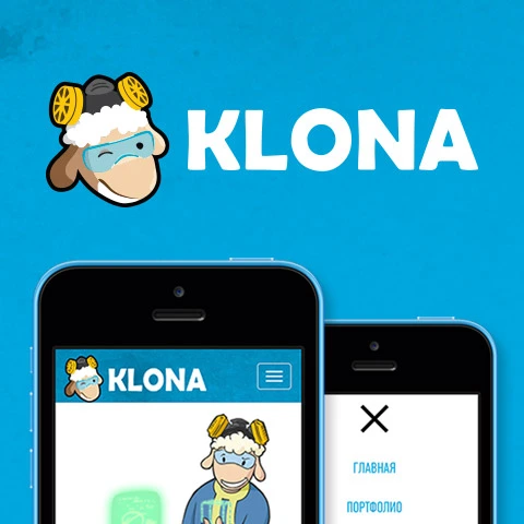
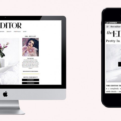
The mobile version of the site runs on a subdomain, and the resource with adaptation has one URL. Mobile site modification aims to simplify page elements. In turn, a site with adaptive design will look as follows: on a smartphone the main interaction options are displayed, on a tablet with a large screen resolution optional blocks and panels, and on a desktop device all the functionality of the resource.
When pondering about who would be suitable for adaptive website development? Then we note that responsive design is a great solution for small sites, blogs, online markets, as well as for corporate or information resources.
YOU GET

A team of 6 people working on the development of a responsive website

Personal manager for the project

Testing and support of the site for 3 months
A team of 6 people working on the development of a responsive website
Personal manager for the project
Testing and support of the site for 3 months
A team of 6 people working on the development of a responsive website
Personal manager for the project
Testing and support of the site for 3 months
Reasons to order the creation of adaptive website design
- Since 2015, Google has ranked sites that are mobile-friendly higher in the search engine. According to Consumer Barometer statistics, smartphones are outpacing desktop computers in usage already in many countries around the world. For Ukraine, the figure is practically 50/50. Therefore, websites that open equally conveniently on all types of devices will be a success.
- Developing a single adaptive website is cheaper than developing apps or creating multiple variations of web pages.
- The amount of time to download is reduced, because no more redirection is needed. In addition, the likelihood of errors and failures is reduced.
- Website conversions go in a single stream, and are not lost due to having multiple versions of a web page.
- The web page retains all content and functionality. Nothing is cut or missing.
The price of adaptive website design depends on:
- the urgency of the order;
- the need for design tweaks;
- like a layout for customization;
- the need to develop from scratch or redesign an existing site.
How much does it cost for adaptive website design in KOLORO studio ?
Write to the manager to clarify the cost.

Why do you need a responsive version of your website?
- It’s convenient. Such a site is available on any gadget.
- It’s holistic. Adapted for all devices, the site retains the style, original design and structure when it loads.
- It saves information. To save all the content of the resource it is enough to simplify navigation and remove a few advertising blocks.
- It’s better indexed. Non-adaptive resources are ranked worse in Google rendition. In addition, since the middle of 2015, the company has launched a mobile-friendly filter, which is responsible for ranking resources that are searched through mobile gadgets.
- That’s better progress. Adaptive resources are easier to optimize, and competent SEO promotion can bring the resource to the top of search queries, because Google prioritizes adaptive sites.
- This builds audience loyalty. To create an adaptive website means to attract additional customers who will give preference to a customizable resource. It is known that 67% of users will minimize a page if it takes longer than 2.5 seconds to load. Only adaptive website layout can provide such speed. Which in addition guarantees the correct display of resource pages and its work without failures.
- This increases conversion rates. Adaptive design implies a qualitative elaboration of usability, i.e. comfortable work and accessibility of each page of the resource. The higher the level of ease of interaction with the resource, the more visitors can become customers of your business.
- It’s competitive. The use of technology will leave behind competitors who are slow to respond to market changes.
Types of creating an adaptive website design
Before choosing the type of responsive design development you need to analyze the content strategy. Only by understanding the nature of the information that will be published on the web page, you can experiment with the most successful layout solution.
Rubber mockup for adaptive website design development
The simplest and most obvious type of content showcase, where the basic blocks are rearranged into a ribbon.
Making adaptive design with block migration
If your site is multi-column, it is better to choose this method. Additional blocks are simply moved to the bottom of the layout. Information is easy to scroll through and elements and buttons are always in view of the user.

Order adaptive design with layout switching
The method is quite labor-intensive, a separate layout is developed for each screen resolution. Despite its unpopularity with developers, this layout is more convenient for users, plus it has fewer disadvantages when loading on different screens.
Create a responsive website design: scaling
A very simple layout that is created by scaling images and text blocks. It is not flexible, may not display well on different devices, so it is more suitable for text-based web resources.
Development of adaptive design: panels
A common enough method for social networks. An additional menu appears when you tap horizontally or vertically (touch the screen). While this method is logical and easy for mobile devices, computer users will have problems, because they may not be able to guess this way of navigation.

Stages of creating an adaptive website design
- Проектирование. At this stage we collect all the introductory information about the project, analyze the market, look for competitors, at the same time there is a setting of goals of the resource, determine its target audience.
- Прототипирование. In this phase, screen interfaces for all types of devices are designed.
- Constructing a modular grid. Based on the previous step, a grid of the future site is created. It is necessary that would develop a comfortable and beautiful design.
- Design . Based on the prototypes, elements are arranged in a modular grid. At this stage, designers work together with developers to maximize the performance of the future resource.
- Верстка. This step involves developing the html code structure in which all the elements of the page will be displayed.
- Тестирование. The resource is tested on different screens. All team members take part in this process: designers pay attention to icons, fonts and indents; developers monitor the optimization of styles and the correctness of display; designers look at the convenience of the resource for the user, ease of finding the necessary information and clear navigation.
Creating adaptive design, KOLORO studio takes into account the wishes of the customer, site content and user preferences. The design will fit all kinds of devices and screen sizes.