The management of the research and production company Agromat Ltd. approached KOLORO with an interesting complex task. The company specializes in the production of insecticides. We have already worked with the company, the result of cooperation was the brand of anti-rodent product “Rattlesnake mix”. Last time we created a brand from scratch. This time, the product already existed and was sold on the shelves. However, the company wanted to broaden its audience and freshen up the look of the packaging.
Task
The analysis revealed that our target audience is people 45+, men and women, gardeners and gardeners, cottage farmers, as well as farmers with small farms that they maintain with their families. The main requirements that consumers put forward to the insecticide:
Consumers expect the following characteristics from insecticide formulations:
The outlets are specialty stores, markets, and large horticultural hypermarkets.
The survey confirmed our expectations: the demand for insecticides starts to grow in early spring and is almost non-existent in winter.
All packages of insecticidal products can be divided into 2 broad areas.
In addition to the style, which can be called “kitsch”, you can distinguish ecological. It is characterized by neat colors (white, all shades of green and brown). Humor is also often used in the design of insecticide product packaging. Another trend is military themes. It can be seen in the naming, design and communication of brands.
After processing the results of the analysis, we started working on positioning. As a result, we arrived at a formulation: a fully ready-to-use, safe, long-acting formulation. If you produce a product but want to change something in it, improve it, contact KOLORO. You can order rebranding from our managers.
Read also: 8 winning brand positioning strategies
The informative icons we have placed on the packaging tell you about the purpose of the product and how it is used. This is convenient for consumers, it is easier for them to understand the mechanics and principle of action of the remedy, to understand whether a particular drug is suitable for their purposes.
On the icons, the designers displayed the entire consumer’s journey in applying the product, as well as showing the insects that Rembek works against.
There are 3 types of remedies in the Rembek series. They do not differ in composition and formula, but they differ in granule color and one color segment on the package. We decided to promote Rembek as an integrated pest management solution. Cycles are needed to create an imaginary distinction that gives consumers confidence in the outcome.
The cyclical nature of the preparations is a trick we developed when creating the TSS. Fears that pests are becoming immune to the product are pushing consumers to switch brands. Cycles, on the other hand, incentivize lingering on a particular brand.
You can order the development of UTP in KOLORO. We endow goods with features that are important to consumers.
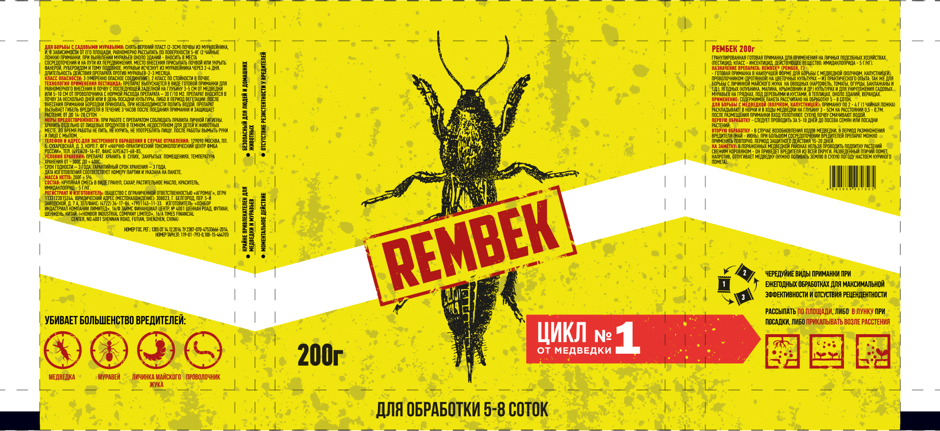
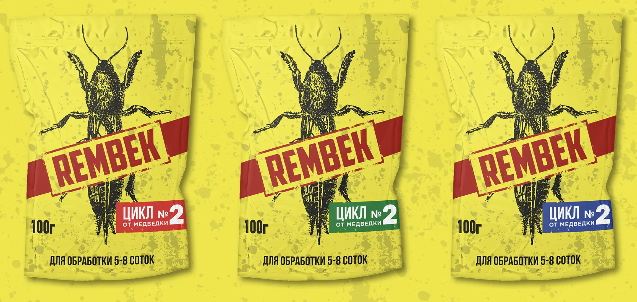
Rebranding the packaging is another important step in Rembek’s renovation. In design, we pushed back on positioning and drew on research.
Concept #1 – Avenger: the packaging depicts a man furiously destroying a bear.
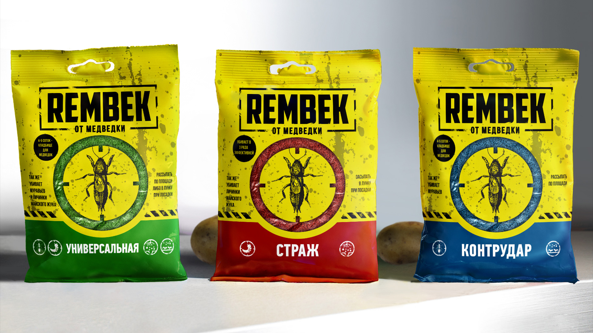
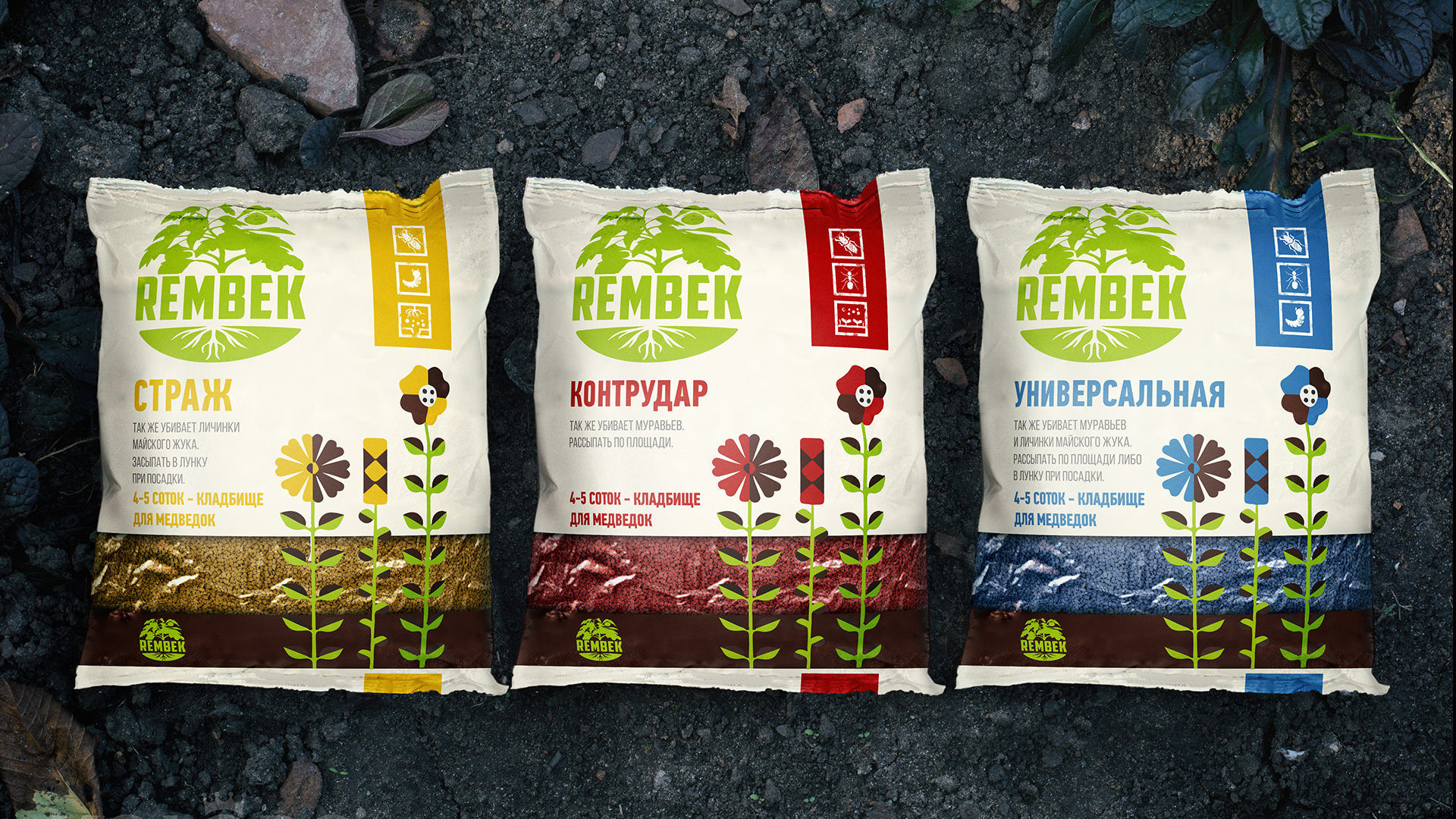
Concept #2 – At Risk: The drug is right on target. We used the color green and an image of freshly plowed land to reinforce the positioning.
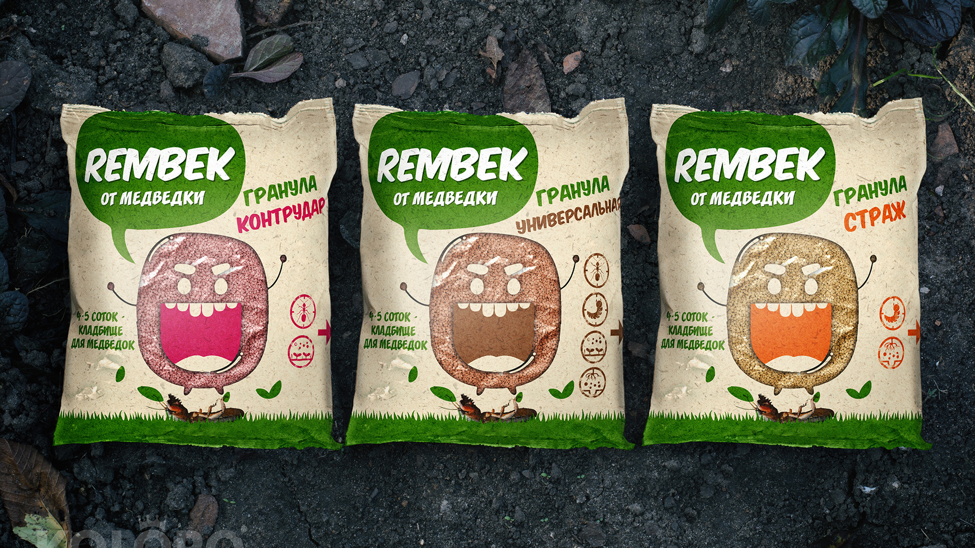
Concept #3 – Ecothematic: white background and maximum associations with safety.
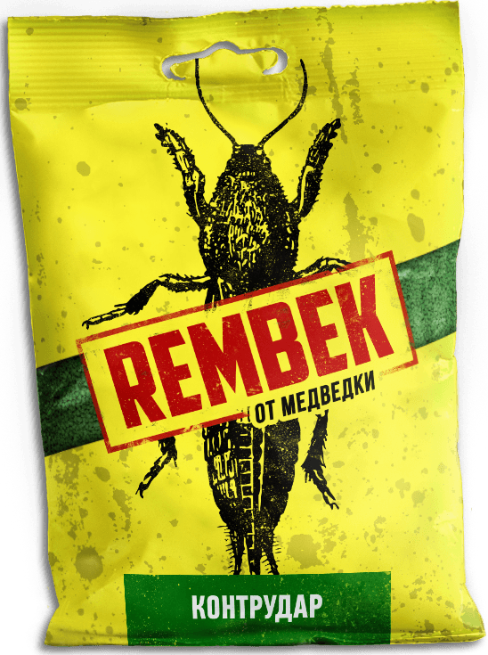
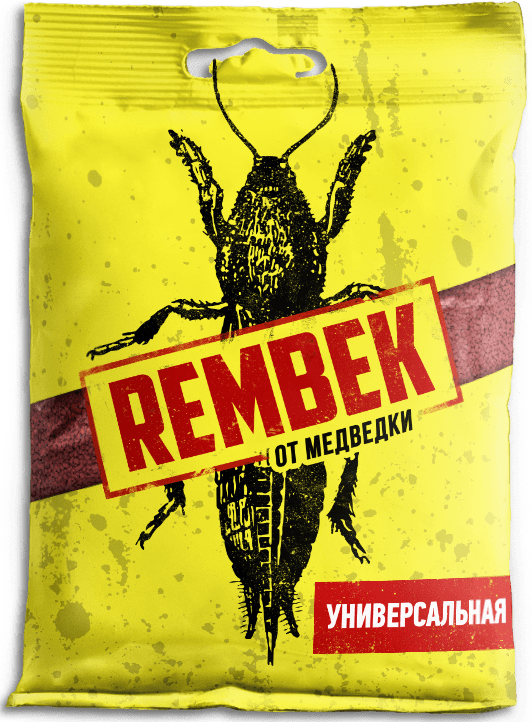
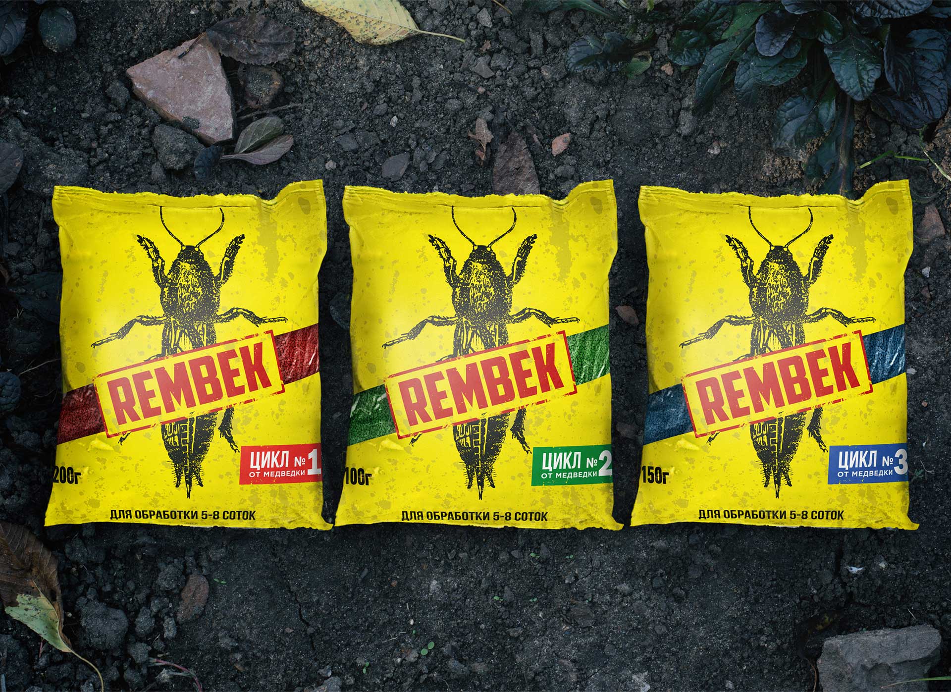
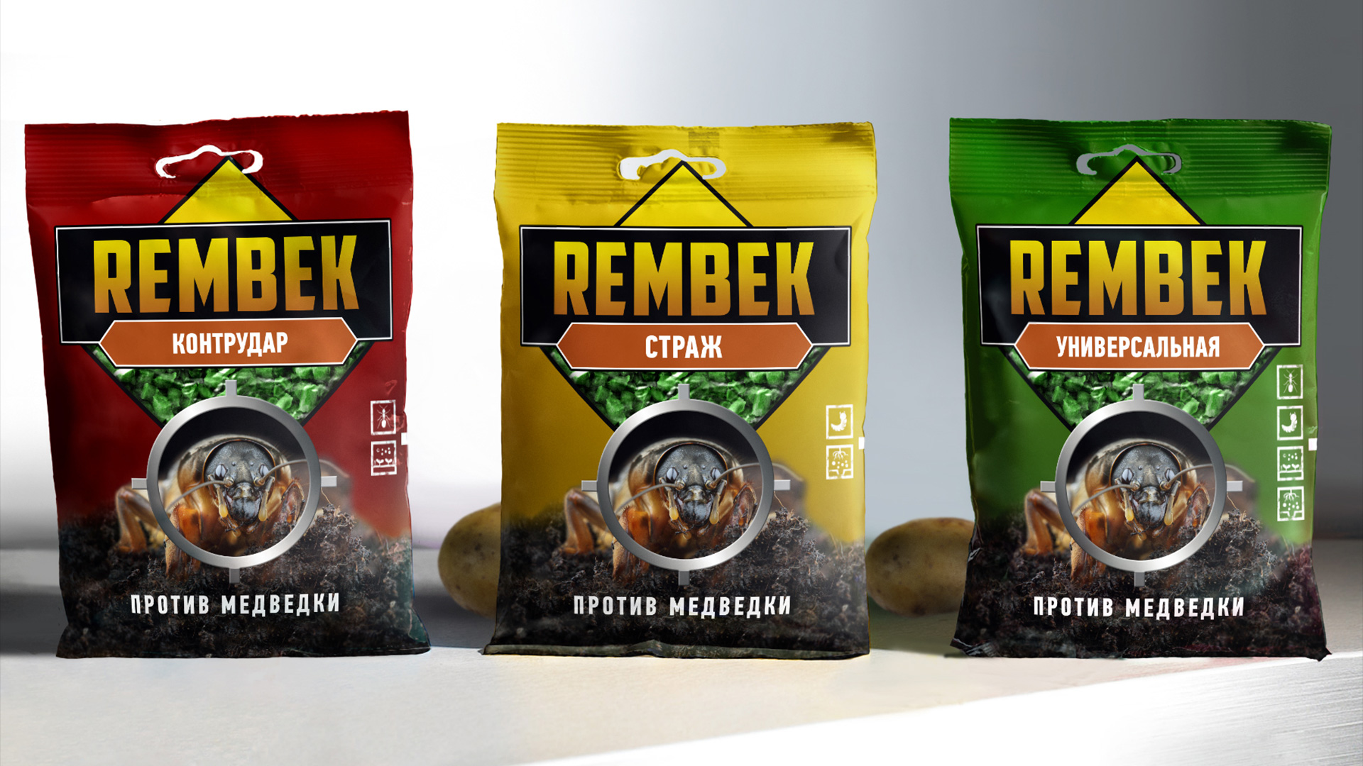
Concept #4 – Bloodstain. A bright spot is placed in the center, which symbolizes the death of the pest. Around the edges, we added transparent inserts that create a sense of curved geometry.
Concept #5 – At Risk (flat style). Similar to concept number two, but in a flat design style.
The customer chose the 4th design option. We tweaked the concept a bit at his request by changing the positioning of the inserts.
The logo is a red stamp, placed in the center of the package. It overlaps the image of the bear. There was a similar image in the previous version of the packaging, where the bear was indicated by a red lightning bolt. Continuing the idea will ensure that the audience that has used Rembek before will not be lost. The bright yellow packaging stands out from the competition and looks good on the shelf.
On the back, we’ve included an infographic as well as technical information about the lineup. Read more about why you should make the most of your counter-label space and examples of products with interesting counter-labels in our article.
The cutting was required for a 200 gram packet. We forwarded all the documents to the printer with the technical documentation.
The printing method we chose is flexography. We based our choice on the type of packaging, and it’s flexible.
The output is a refreshed brand that meets consumer demands and stands out on the shelf. The first slices of sales figures exceeded customer expectations, the new packaging and UTP proved to be effective.